 This is an example of a star plot. A stor plot is a a graphical method displaying multivariate data. Each of these data pots or stars represent a sigle observation. www.commons.wikipedia.org/wiki/Category:Star_plots
Friday, April 23, 2010
Star Plot
This is an example of a star plot. A stor plot is a a graphical method displaying multivariate data. Each of these data pots or stars represent a sigle observation. www.commons.wikipedia.org/wiki/Category:Star_plotsCorrelation Matrix
 This is an example of a correlation matrix. A correlation matrix shows the covariances between elements of a random vector. www.livestockgenomics.csiro.au/Genome_to_Phenome/
 Windrose
 This is an example of a windrose graph. This graph shows representations of wind speeds and directions in a windrose multiplied by their percentage of concurrance. www.lion.cs.uiuc.edu/projects/wsn_ornl.html
Climograph
 Climograph is a graphical representation of the basic climatic parameters, that is mostly average temperature and precipitation, at a certain location. it is used for a quick-view of the climate of a location.
http://en.wikipedia.org/wiki/Climograph
Population Profile
 This is a example of a population profile that compares age class to percentage population. This graph was done to show the population growth curve for Mobile County in 1998. www.camelia.shc.edu/.../statisticassign.htm
 Triangular plot

A triangular plot, also known as a ternary plot, is a barycentric plot on three variable which sum to a constant. It graphically depicts the ratios of the three variables as positions in an equilateral triangle.
Scatter Plot
 This is an example of a scatter plot, the individual blue dots show the results of each sample. This study compared the age of the husband compared to the age of the wife. www.mzandee.net/.../chapter4/pearson.html
Index Value Plot
 This is an example of a index value plot of the United States since June 22, 1999. It compares the average streamflow index and the years studied. www.waterwatch.usgs.gov/?m=real&w=plot
Lorenz curve
 This is a graph of using a Lorenz curve. This graph illustrates enequality by comparing percentage of households and percentage of income. www.math.yorku.ca/.../milestone/milestone.pdf
 Bilateral Graph
 This is a bilateral graph of the Japan's environmental official development assistance from 1994 - 1998. www.mofa .go.jp/.../pamph/2001/oda.html
Nominal Area Choropleth Map
 This is a nominal area choropleth map of the United States. This map shows the minority groups with highest percent of state population. www.e-education.psu.edu/.../policies.shtml
Similarity Matrix
 A similarity matrix is a matrix of scores which express the similarity between two data points. They are used in sequence alignment.
Unstandardized Choropleth Map
 This is an unstandardized choropleth map of Minnesota, Wisconsin, and Michigan. This map represents the total number of ski shops by county. www.uwec.edu/.../northwoods/silent_sports.html
Standardized Choropleth Map
 This is a standardized choropleth map of Canada, which shows the percentage of population aged 14 years and under by the Census Division of Canada. www.statcan.gc.ca/.../figures/5200001-eng.htm
Histogram
 A histogram is a graphical display of tabular frequencies, shown as adjacent rectangles. each rectangle is erected over an interval, with an area equal to the frequency of the interval. The height of a rectangle is also equal to the frequency density of the interval.
http://en.wikipedia/wiki/Histogram
Univariate Choropleth Map
 This is a univariate choropleth map of the United States. This map shows the percentages of individuals living in the poverty, by county, in 2000. www.cdc.gov/pcd/issues/2007/oct/07_0091.htm
Box plot
 A boxplot is a convenient way of graphically depicting groups of numerical data through their five-number summaries. A boxplot may also indicate which observations, if any, might be considered outliers.
http://en.wikipedia.org/wiki/Box_plot
Stem and leaf plot

A stem and leaf plot, also known as a stemplot, is a device for presenting quantitative data in a graphical format, similar to a histogram, to assist in visualizing the shape of a distribution.
Bivariate Choropleth Map
 This is an example of a bivariate choropleth map made by Frenchman Charles Dupin's. www.indiemaps.com/blog/page/2/
 Unclassed Choropleth Map
 This is a unclassed choropleth map of the proportion of children aged 0-15.
DLG Map
 This is a DLG map of the Athens, Georgia. DLG, which stands for digital line graph, is a form of digital map developed by the United States Geological Survey. www.ga.water.usgs.gov/olympics/athens.html
DRG Map
 This is a DRG map of Washington D.C. DRG, which stands for digital raster graphics, are used mostly in the United States to show topography. www.egsc.usgs.gov/isb/pubs/factssheets/fs08801.html
Isopleth Map
 This is a isopleth map of North America. Isopleth maps consists of lines connecting places of equal value of distribution for a given theme such as rainfall or temperature. www.weathernotebook.org/images/winter/3.jpg
Classed choropleth maps
 A choropleth map is a thematic map in which areas are shaded or patterned in proportion to the measurment of the statistical variable being displayed on the map, such as population density ot per-capita income.
Isopach Map
 This is a isopach map of Mount Pinatubo that erupted on June 15, 1991. An isopach map is a map illustrating variation thickness within a tabular unit. www.pubs.usgs.gov/pinatubo/spence/fig2.gif
Isohyet map
 This is a isohyet map of Texas. This isohyet map shows the average annual precipitation in texas from 1951-1980. www.lib.utexas.edu/.../images/p6fig4.gif
Isotach Map
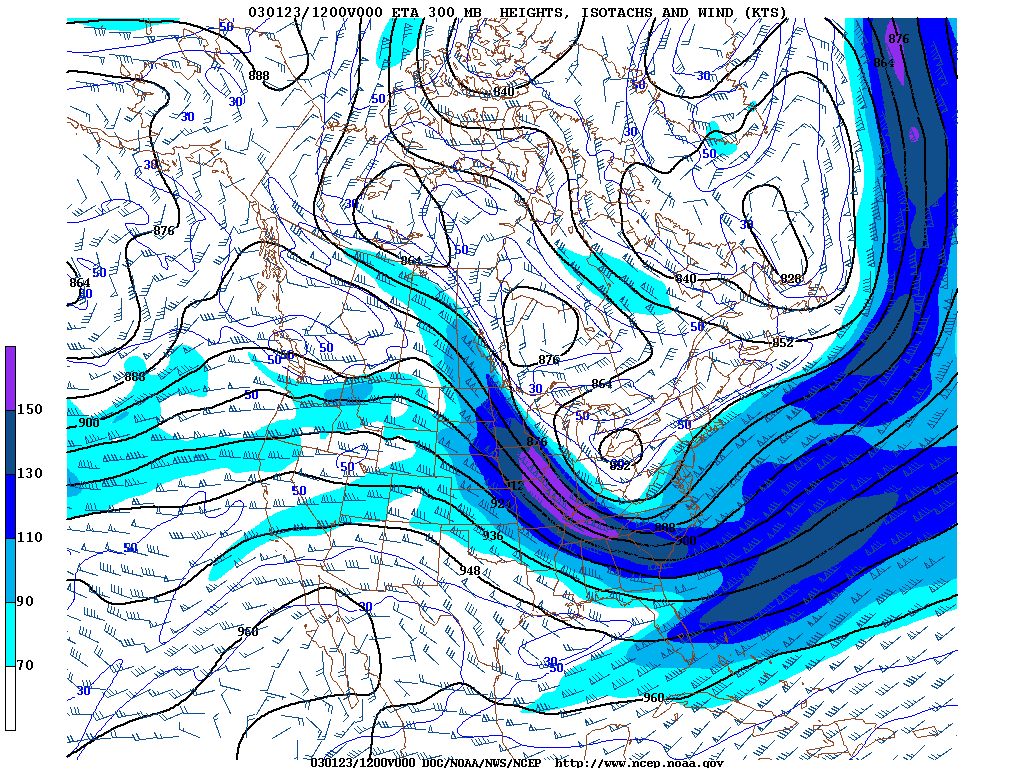 This is a isotach map of the Appalachian mountains in the South Eastern Unites States. An isotach map shows lines in a given surface connecting points of equal wind speed. www4.ncsu.edu/~nwsfo/storage/cases/20030123/
Isobar map
 This is an isobar map of the United States. Isobar maps shows lines connecting points of equal atmospheric pressure. www.ems.psu.edu/~nese/ch8web.htm
LIDAR Map
 This is a LIDAR map of the Manhatten, New York. This LIDAR map was used after 9/11 to determine what cranes are necessary to remove the rubble. www.noaanews.noaa.gov/stories/s798.htm
Range graded proportional circle map
 With range grading, a symbol represents a range of data values. It's widely used in the form of thematic mapping.
Doppler radar map
 This is a dopler radar map of the south east United States. This dopler radar map shows a storm hitting land. www.paulsweatherportfolio.net/.../page31.html
Continuously variable proportional circle map

A continuously variable proprtional circle map is a proportional circle map which utilizes circles to create point data. The circles are in proportion to variable being measured.
http://www.lib.utexas.edu/maps/europe/west_germany_ind_1972.jpg
Black & white aerial photo
 This is an black & white aerial photo, which is used to get a better view of an area that they are working on. www.freegeographytools.com/2007/goofing-around-with-pan-sharpening
Infrared aerial photo
 This is an infrared aerial photo of a Michigan highway, they are using this infrared aerial photo to help in designing and building of a new highway system. www.michiganhighways.org/images/michigan_left2.html
 DOQQ

The DOQQs have various shades of red in them, while the aerial photos are in black and white. The red color of the DOQQ can be changes to display as black and white.
www.crwr.utexas.edu/gis/gishydro00/Class/trmproj/Donnelly/termproject.htm
Cartographic Animation
 This is an example of cartographic anamation map of New Orleans, Louisiana. This cartogrphic animation of a weather occuring at the time. www.gearthblog.com/images/images1006/noaa.jpg
Statistical map
 This is a statistical map of the United States. This statistical map shows the percent change in resident population from 1990 to 2000. www.washingtonpost.com/.../cencus/percent.gif
Cartograms
 This is a cartogram of the east and central United States. A cartogram is an abstract and simplified map the base of which is not true to scale. www.ncgia.ucsb.edu/projects/Cartogram_central/
Flow maps
 This is a flow map of the United States. This flow map that represents the truck frieght throughout the nation. It was made in 1998 by the U.S. Federal highway Administration. www.lib.utexas.edu/maps/texas/combtrk_tx_1998.jpg
Thursday, April 22, 2010
Isoline map
 This is a Isoline map of China. This Isoline map depicts the runoff depth off cities of China. www.une.edu/.../unupbooks/80157e/80157E0b.htm
 DEM

A Digital Elevation Map (DEM) is a digital representation of ground surface topography or terrain. DEMs can be represented as a raster or as a triangular irregular network, and are used often in geographic information systems.
Proportional circle map

This is a proportional circle map of Germany. This proportional map shows the different cities in Germany and gives a pie chart of what major industies are producing goods. www.lib.utexas.edu/maps/europe/west_germany_ind_1972.jpg
Choropleth maps
 This is a choropleth map of florida, which shows the percentage of people who are Hispanic per county in Florida based on the 2000 Census data. my.ilstu.edu/~jrcarter/Geo204/Choro/Tom/
Dot distribution maps
 This is a dot distribution map of the world. This dot distribution map uses red dots to show where active volcanos are located around the world. www.geophysics.rice.edu/plateboudary/volcano.72.gif
Wednesday, April 21, 2010
Propaganda map
 This is a propaganda map of Europe that was made by J. Amschewitz, in London, England. The map shows all of Europe attacking an eagle, which represents the United States of America. www.flickr.com/photos/bibliodyssey/2722416012/
 Hypsometric maps
 This is a hypsometric map of France. Hypsometric maps are used by cartographers to show the differences in elevation of the land. On hypsometric map cartographers use different colors to explain different levels of elevation, for example this map has high elevations as lighter colors and lower elevations as darker. www.reliefshading.com/colors/hypsometric.html
PLSS map
 This is a PLSS map of central and northern florida. This map is used to divide up public land which are owned by the Federal Government. sjr.state.fl.us/.../docs/themes_090209.html
Cadastral maps

This is a cadastral map, that shows the different land uses in the areas and the boundaries and ownership of land parcels. www.dgs-gis.cz.mapy.php
Thematic map
 This is a thematic map of Canada in 2000. This map represents the land that is covered by major drainage areas. By using color cordination it gives the reader a better illustration of the different land types. www.statcan.gc.ca/mgeo/ex2-eng.htm
Topographic map
 This is a topographic map of Old Job Quarry on the North side of Cristo Rey in New Mexico. This map gives us the different elevations at specific locations on the land. www.sunstar-solutions.com/.../mid-Cretaceous.htm
Subscribe to:
Posts (Atom)